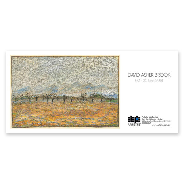
INGALLERY.1 and ONLINE
07 – 29 March 2020
David Asher Brook: Solo Exhibition
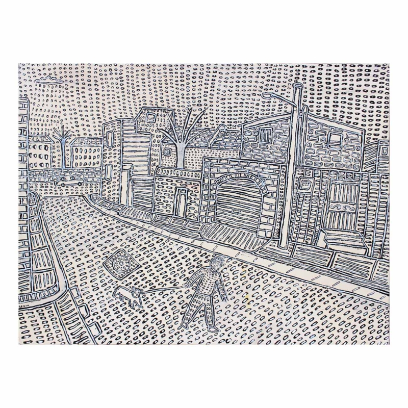
For me plein air painting is a play between the figure and the landscape. Recently I´ve found myself thinking that trees are like figures. Because there are different orientations of directions where the paint is, for example the ground will usually go down horizontally, the walls of a house will come forward and then there are these trees there. Each of these things connote different forms of direction, like the tree is sticking up and branching out, or the figure is walking across a background, moving somewhere, or standing still, like a full stop.
All these things connote different levels of movement and different kinds of placements or composition of things. They all have their own place.
This is David Asher Brook´s first Solo Exhibition at Artsite Contemporary.
SOME MORE WORDS…
I enjoy and look forward to painting from everyday life because it is experiential. The experience is not only the act of painting but the shift of looking at the world from a different perspective. I find this is accentuated when being away, because you are already in that mode.
It´s when you´re not on your way anywhere, but just hanging around for the sake of seeing and experiencing this, that you get a richer feeling of your reality. You develop a feeling for the place you are, even if you´re painting your own street, and that feeling of a sense of place can sometimes last for hours after.
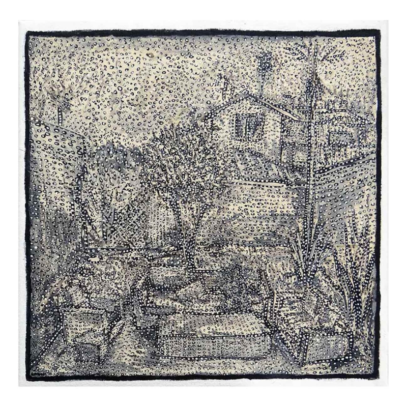
When painting I find the imagery emerges from stuff like shapes, a dark patch, a green bit over there. It´s a lot about being in the moment. This is different to when painting strokes and patterns, which is a more process-based way of making art.
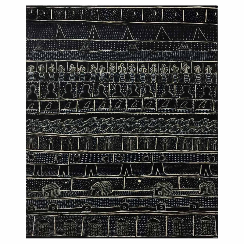
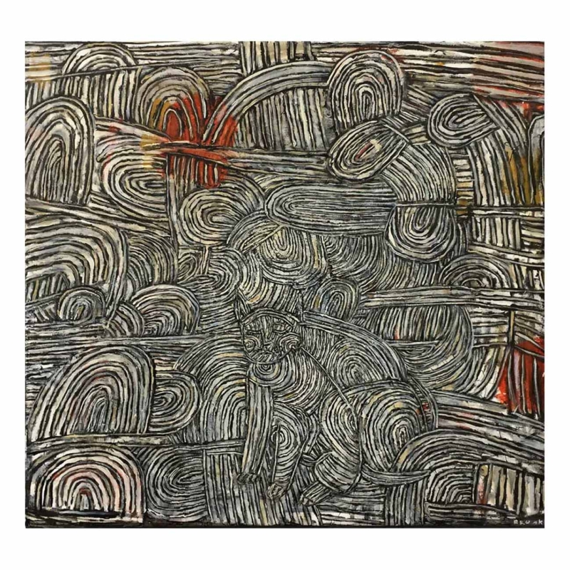
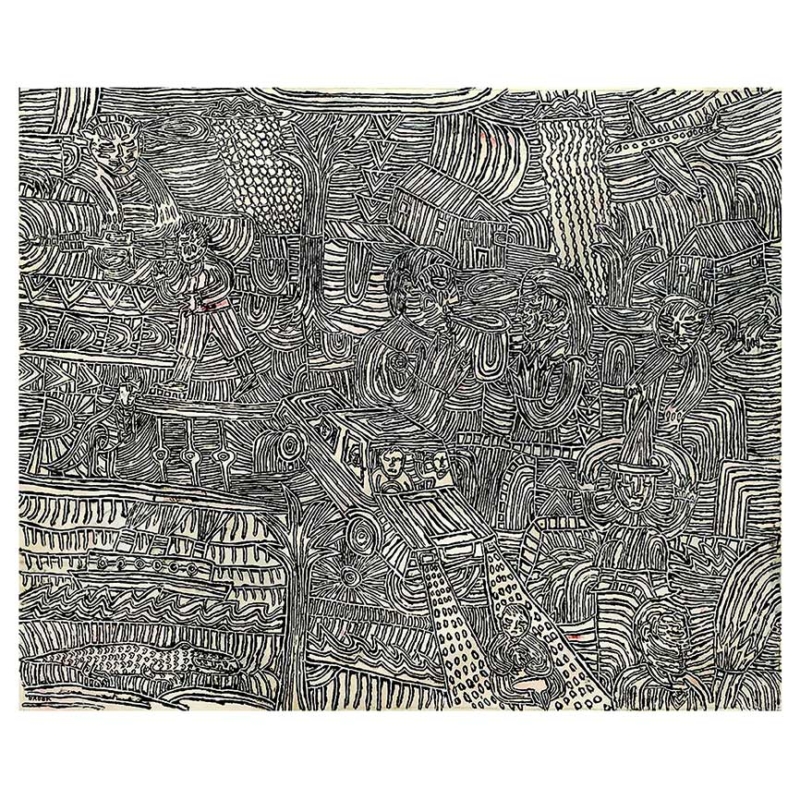
I need the pattern making, I don´t know why really. I need detail. I like to give myself more work for some reason. I like the unity it brings to the painting. If there´s too much weight in any part of the image, I can see that higher contrast, it takes my eyes to it. But I would rather my eyes not have a landing spot. I think these patterns unify the image and take the edge off the contrast.
That can really be seen anywhere, on a cloudy day and the late afternoon, which is when I would rather paint outside. I work in the cemeteries most days and on the many cloudy days I see much more to paint. I see this in some of Leon Kossoff´s paintings of London street scenes. I can see straight away in the painting that it was a overcast day.
What I enjoyed about painting in China is that the sky and the land are very much connected, and that´s what helped me to create this lower contrast, or unity within the painting. There wasn´t a sharp edge or contour going on between the horizon and the sky. They melded into each other, and that´s because the sun is behind a veil of atmosphere or pollution and this kind of diffuses the light, so the light is softer on the landscape and softer in the sky, and brings down a certain colour range that I really liked.
I´m not painting from the point of view of someone who has thought about why and what they´re doing in any conceptual sense, I´m retro-fitting any ideas backwards. Why anyone goes for a certain visual aesthetic I don´t know. Why you choose those colours, and not others for example, I don´t think can be articulated, because these decisions are not word based. They are someone´s sensibility or ideals that are formed in a visual context or perception, and for me those visual perceptions are my use of colour, the composition and the pattern making.
I think the patterns give the paintings something, maybe a sensitivity and a consistency, and also a kind of discipline in that nearly everything has been approached with a stroke and a kind of marked dot, which all lend subtlety to the depiction in the painting. Because they´re all of different weights and arranged in different orientations, they suggest some form of visual layout to the painting.
However in some paintings there´s no indication of this – where the patterns conform with the image, for example, where I don´t make them twist around the hands, or go around the background. I just apply them in series but also indiscriminately all across the painting, so in a sense it´s not done to enhance the painting specifically in terms of perspective and so forth, but to lend a level of layer and unity to the image.
I enjoy mixing the colours, I don´t like to use colours straight out of the tube, they´re too bright. I like paintings that have a subtlety of the colour or a specific tonal range.
In the pattern making, I realised I like to hide things. I like the fact that you can get lost in it, that an image is there but is also not overtly there. I am not drawn as much to imagery that is too obvious; too high contrast. I find a more enduring sense of interest in work when there are things that are not obvious. ~ David Asher Brook, June 2018